Top down Brand Design
Simple, innovative, HONEST
Tasked with working alongside the company founder to define, create, and design the brand identity for Start-Up Pesca Innovations, a company specializing in gear storage for outdoor activities, fly fishing and snow sports.
Client: Pesca Innovations (Outdoor Equipment Storage)
Role: Creative Direction, Brand Strategy, Visual Identity Generation
Collaborated With: Founder
Company Overview
Pesca Innovations is a company dedicated to improving the angling experience. They specialize in creating purpose-made storage solutions for fly fishing gear. Their business model is streamlined with products made to order, minimizing waste and environmental impact.
Brand identity
Mission | Vision | Ambition
OUR MISSION:
To inspire the pursuit of adventure by removing the barriers of getting out the door.
OUR VISION:
To build authentic connections, revolutionary innovations, and aid in spending time outdoors.
OUR AMBITION:
Pesca Innovations as the most respected and desired outdoor gear storage solution brand. A brand that through its action lives up to its promises.

Brand ComponeNts
Logo | Color | Graphics

The Logo
Designed by company founder Nikolai Ambwani
“Our logo embodies the ideals of Pesca Innovations. The middle section of the logo resembles the mountains of Colorado where our company was born and continues to grow. The sides of the logo resemble two arrows, a smaller to a larger one representing growth and forward progress, never moving back. These three pieces all together create a simple fish, something that is simple in its form yet extremely functional. Our products are the same.”
Lockups:

PRIMARY:
The Primary lockup is the most versatile and meaningful element of the brand’s visual identity. Used across media and platforms. (Marketing collateral, merchandise, packaging)
HORIZONTAL:
Used in situations when there is limited vertical space or when large amounts of horizontal space need to be branded. (website banners, physical banners, headers/footers, product, merchandise)
JUST THE ICON:
A necessary part of the Pesca brand identity. Used when just the artwork can stand alone without additional text, as the most recognizable symbol of the Pesca brand. (product engravings, website, online shop icon, social media icon, packaging)

MADE IN THE USA:
The Made in the USA lockup combines the primary logo with the “Made in the USA” verbiage. Designed for use cases where patriotism as a brand value needs to be leaned into. (marketing collateral, merchandise, product, product packaging, business cards)

COLORADO MADE:
An important lockup showing the brand’s history and connection to Colorado. Used in Colorado-based stores, and events. The primary purpose is to emphasize the brand's dedication to Colorado and its waters. (Apparel, Colorado-based marketing collateral)
COLor:
Primary Brand Colors
Colors reminiscent of the environment in which Pesca supports and aids in the recreation in.
PESCA BLUE
HEX: #00AEEF
RGB: 0, 174, 239
CMYK: 94%, 25%, 0%, 6%
WINTER NIGHT
HEX: #1A1A1A
RGB: 26, 26, 26
CMYK: 0%, 0%, 0%, 90%
RUN-OFF
HEX: #FFFEFA
RGB: 255, 254, 250
CMYK: 0%, 0%, 2%, 0%
Colorado’s “Big 5”
Secondary brand colors, inspired by the species of Colorado trout.
COLORADO BROWN
HEX: #E6A400
RGB: 230, 164, 0
CMYK: 13%, 38%, 100%, 0%
BROOKE ORANGE
HEX: #FF4D00
RGB: 255, 77, 0
CMYK: 0%, 84%, 100%, 0%
TIGER GREEN
HEX: #555019
RGB: 85, 80, 25
CMYK: 57%, 51%, 100%, 42%
CUTTHROAT RED
HEX: #E72F00
RGB: 231, 47, 0
CMYK: 9%, 93%, 100%, 1%
RAINBOW PURPLE
HEX: #DD7DA3
RGB: 221, 125, 163
CMYK: 15%, 63%, 16%, 0%
Typography:
Aa
MONTSERRAT
Montserrat - Thin
Montserrat - extra Light
Montserrat - Light
Montserrat - Regular
Montserrat - medium
Montserrat - SemiBold
Montserrat - Bold
Montserrat - ExtraBold
Montserrat - Black
Graphics:

Local Topography
A primary graphic element of Pesca Innovations’ graphic identity is the topography lines of specific and significant geographical areas. Founded in Edwards, Colorado, this topography is of that area, highlighting the waterways in which we fish.
Visual Identity

Photography Guidelines
SIMPLE. HONEST. ASPIRATIONAL
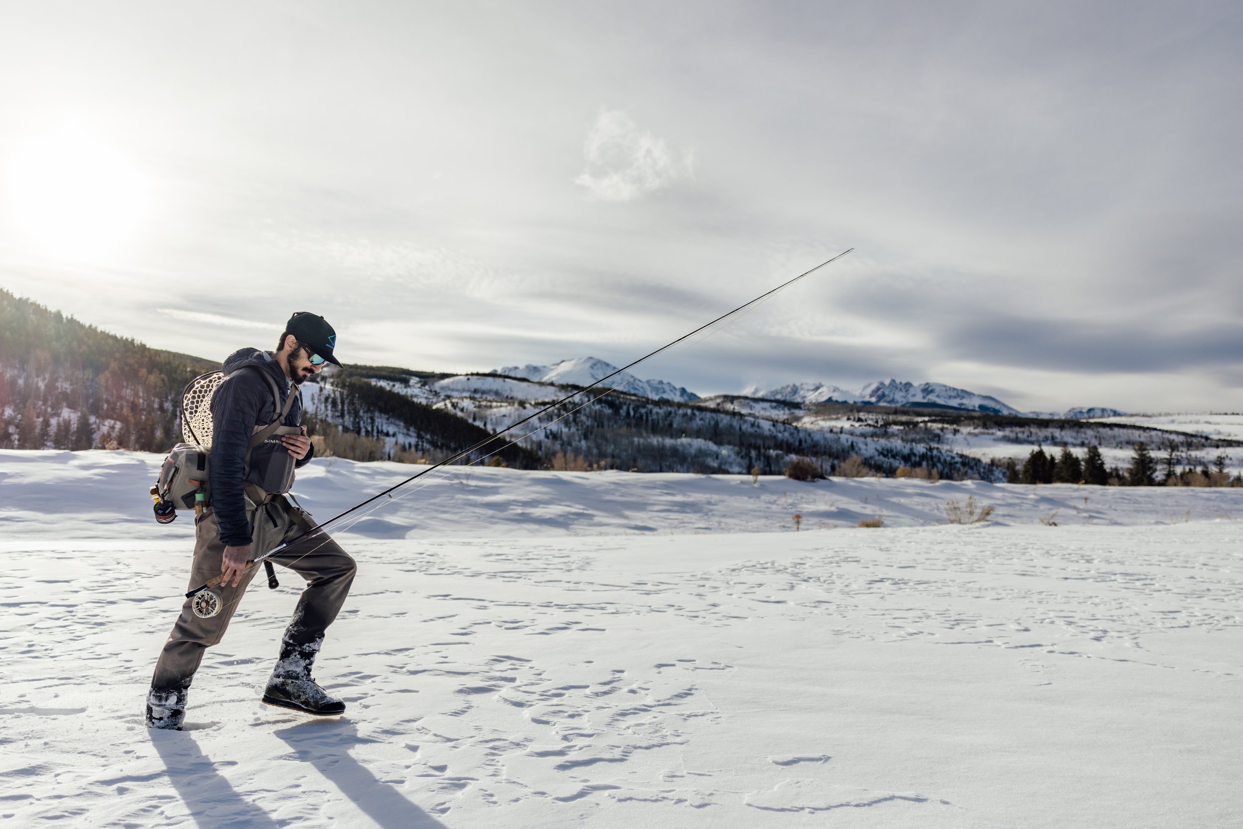
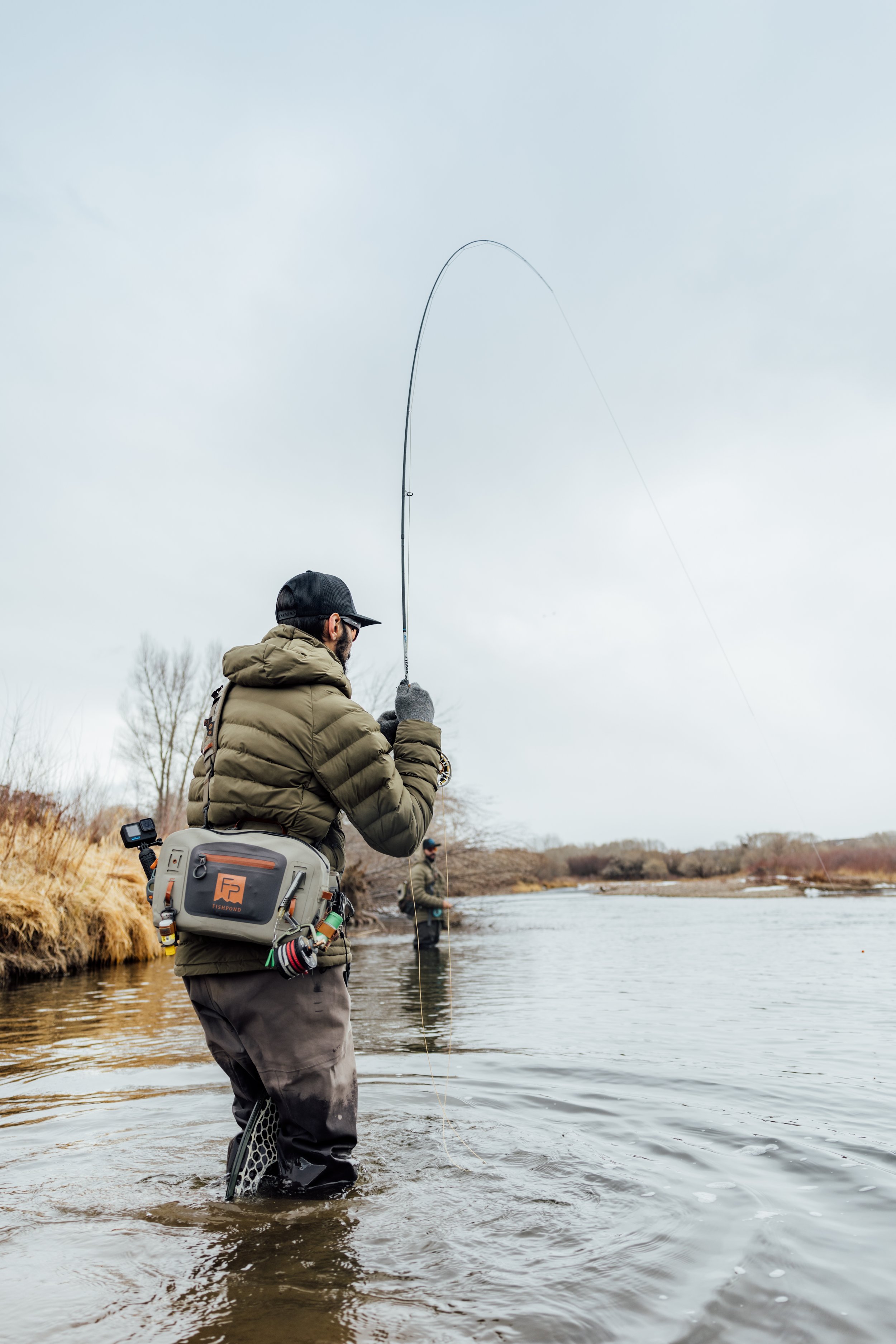
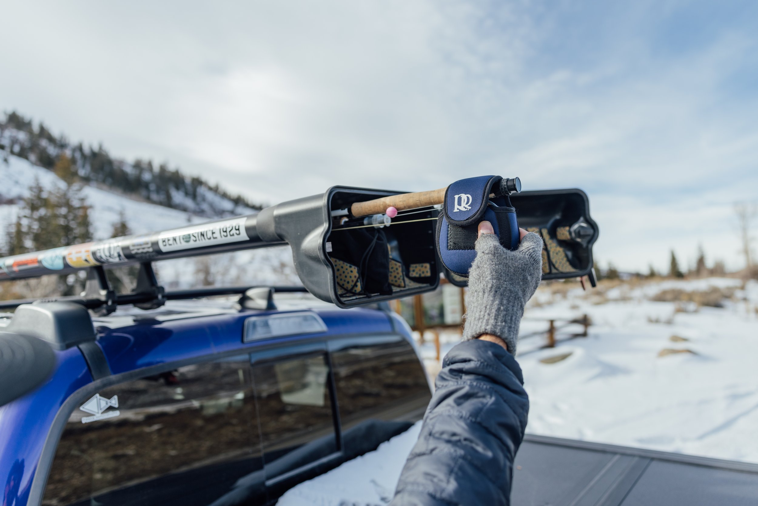
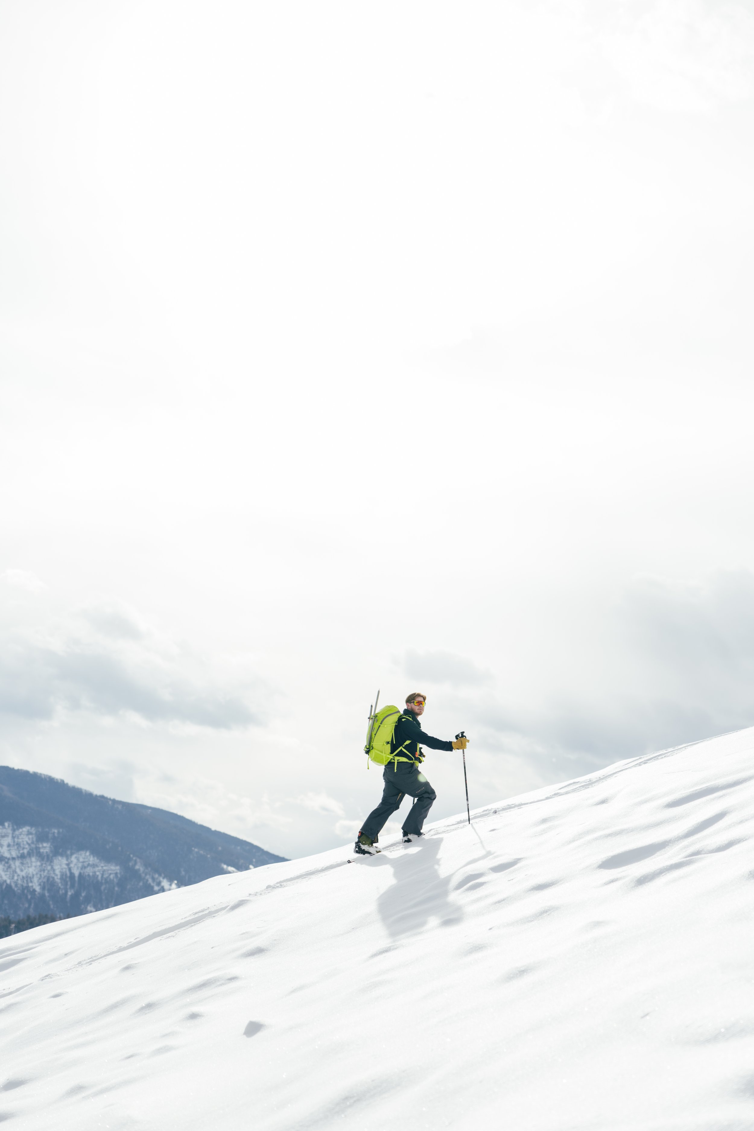
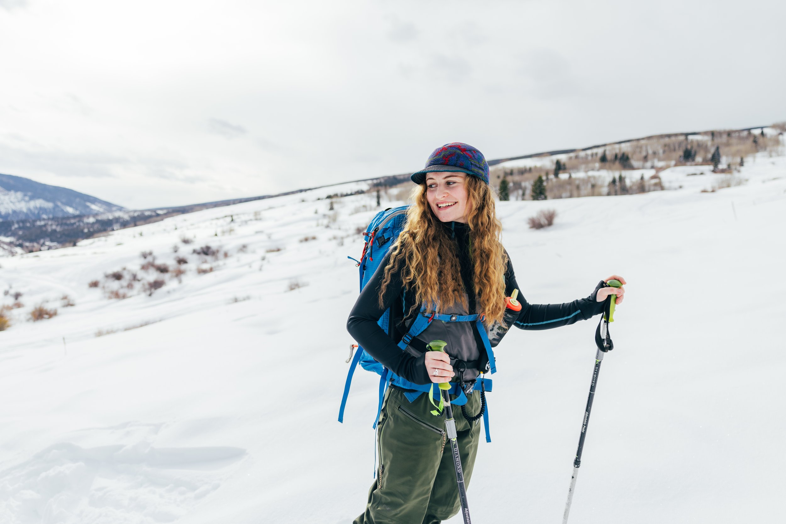
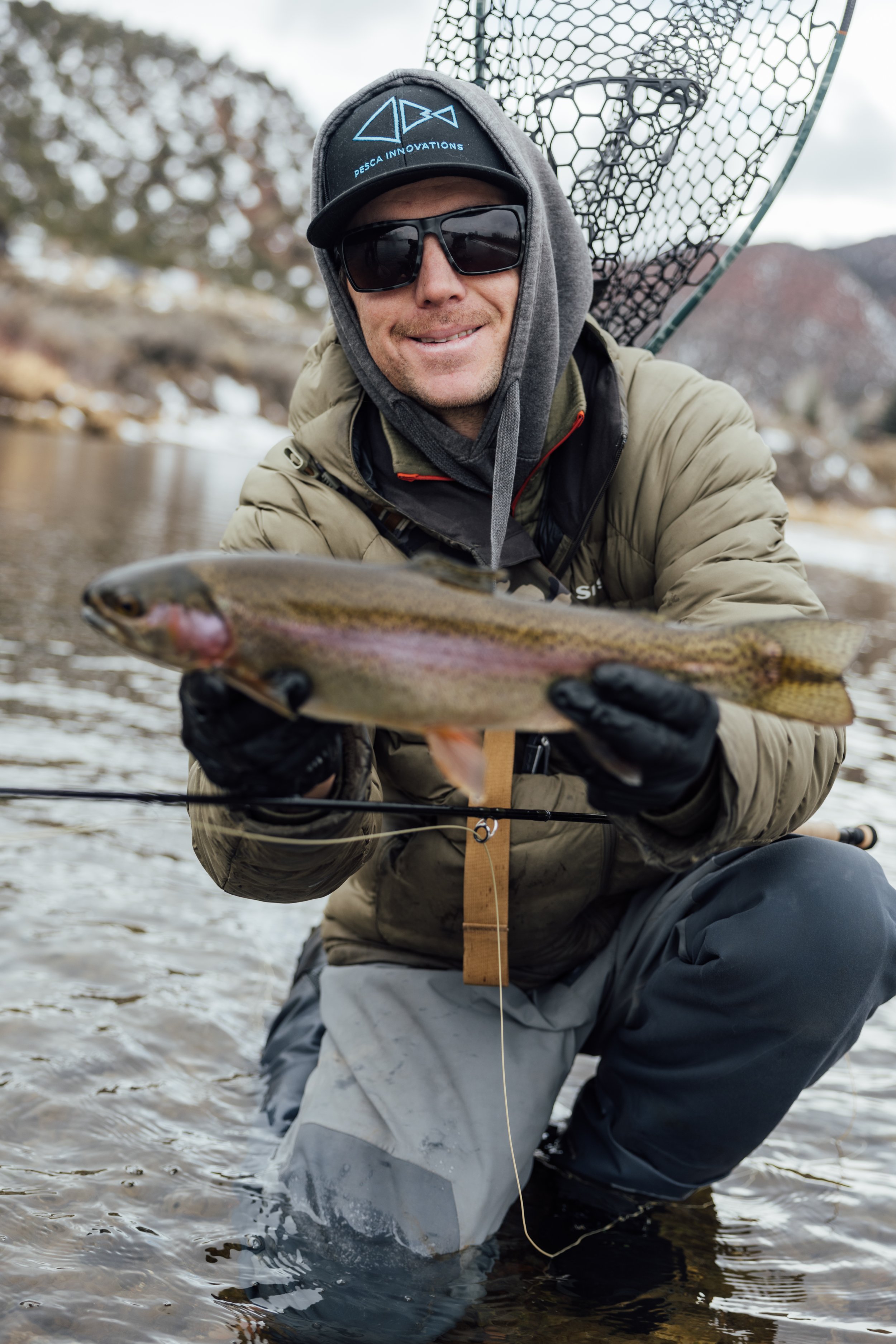
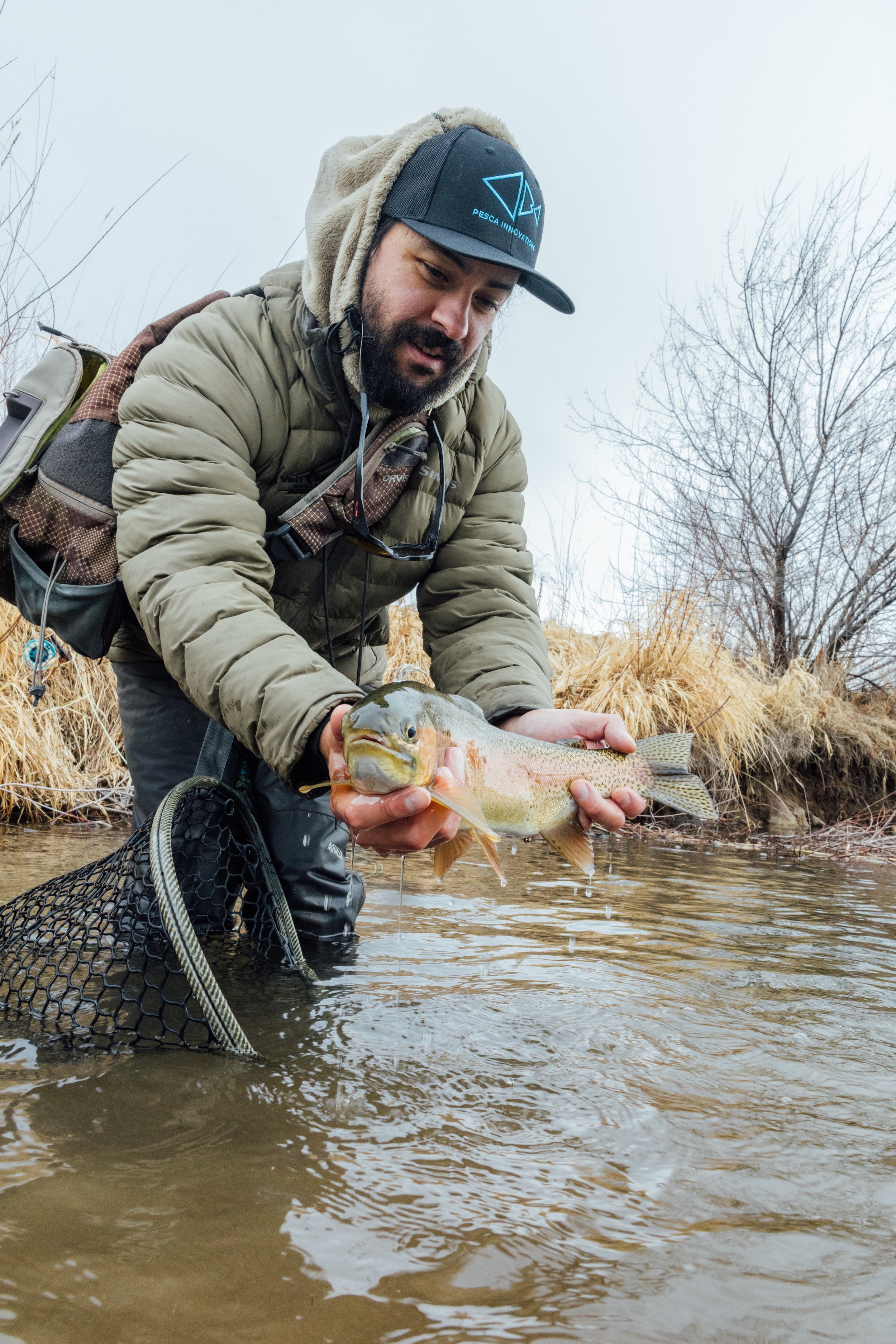
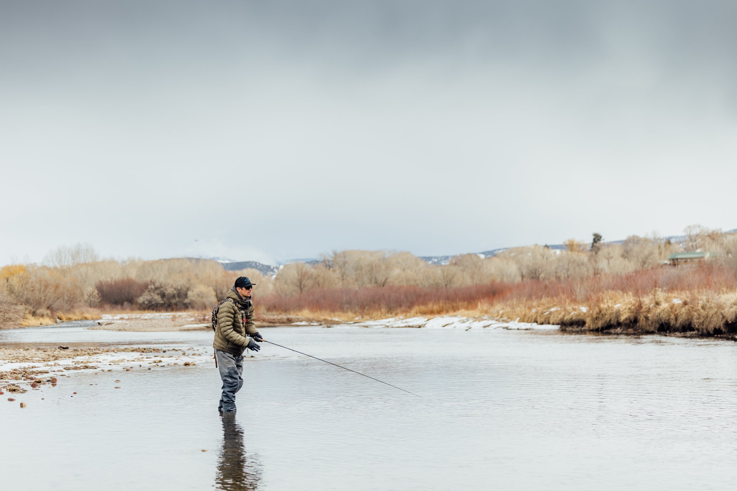
Photography is the primary driver of Pesca Innovations’ brand identity. Images are an opportunity to showcase the lifestyle we support. People fish, catching fish, tasteful grip’n grins. Images should showcase the whole story, showing loading the truck, to boots off at the end of the day. White back product imagery is used only for PDP. Lifestyle brand-forward product imagery used elsewhere, i.e., pulling rods off the wall holder, etc. Images show the lifestyle that is possible because of our product.

Visual Identity
CLEAN. INTENTIONAL. INNOVATIVE
Pesca Innovations visual identity must communicate brand values as a primary way of building brand loyalty and having a great customer experience. We sell the opportunity for fisherman to spend more time on the water, to celebrate their passions. Our visual identity is intentional, everything we do is designed to further communicate our commitment to fishermen and the resources we recreate in.
BRAND Image Gallery